Questioning the Answers
Another lesson in statistics for those who are interested in understanding the tricks of the trade. Lies, damned lies and statistics!
Questioning the Answers
Shattering the Efficacy Illusion, Part 6
"I have yet to see a piece of writing, political or non-political, that does not have a slant. All writing slants the way a writer leans, and no man is born perpendicular." -E.B. White
Articles from the Vaccine Wars can be found here, including the first five articles of this series. This may be necessary to handle all the acronyms. My apologies for taking this series on a bit slowly. My attention has been pulled in many directions.

We might as well cover the second-order debates while we're on the topic of how the Healthy User Bias (HUB) shatters the illusion of efficacy as was reported in rushed and likely fraudulent trials. One of the problems in the Age of The Science is the strange lack of curiosity in the details behind the process that was classically referred to as…science.
Inevitably—and not entirely without reason—those who are in control of their faculties, are not yet convinced (or are motivated to appear unconvinced) of the Zero Efficacy Hypothesis (ZEH) as I have presented it will chime in about various forms of data that are part of the Efficacy Illusion that I've laid out. While I may phrase these as statements, they could be phrased as questions. Questions and discussion are better, no doubt. I choose here to mirror the rhetorical combat and online sparring games for effect.
Now, before I move forward, I'd like to reground the debate over the ZEH with key historical points:
Technologies such as mRNA cell transfection being used in the current vaccines are brand spanking new. In 20 years of prior testing, they never previously worked. The notion that researchers at two different companies (Pfizer and Moderna have oddly identical stories of designing their vaccines over a weekend right when the first genetic sequences of SARS-CoV-2 were released) confidently architected successful vaccines in two or three days should strike any reasonable person as suspicious.
Prior attempts at creating vaccines for coronaviruses all failed historically. Researchers considered the very real possibility that such vaccines might be unachievable, or at least never be found. This discussion may have even driven fear during the early days of the pandemic.
"How could so many studies get this wrong? Seems implausible."
There are too many implausible claims during the pandemic to stop an important investigative line of reasoning. Read the room: we're in a world war. A global civil war. A war that most people around the world didn't notice even as it began. Truth is the first casualty of war, but usual descriptions of plausibility follow soon after.
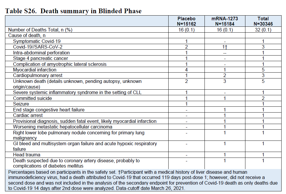
Two studies out of Israel were promoted as firmly demonstrating results consistent with the Pfizer and Moderna trial results. These studies were not critically engaged before they were cheered widely among vaccine partisans and biotech stock holders.
One of them (Dagan et al, 2021) was put together by a team that admitted broad investment in Pfizer. They did not disclose their raw data, but notably measured mortality 14 to 21 days after dosing for a disease with a median time to death of 18.5 days. There is little good explanation for how to play Twister around this statistical conundrum. Professor Norman Fenton and his team showed that the lack of person day risk adjustment (the unvaccinated cohort spent much more time on average during the high risk period) likely led to a massive overestimate of VE, and the remaining apparent VE is likely HUB.
The second of these studies (Haas et al, 2021) uses a rolling cohort method that requires a risk-adjustment that the authors admit to not performing near the very end of the Supplementary section, buried in the details, self-excused with the presumption that it wouldn't make a large difference. Professor Mark Reeder demonstrated with a simulation on a null (saline) vaccine that the difference is similarly enormous as to the Fenton demonstration on the Dagan study.
A careful Statistician should scratch their head at these sorts of "rookie mistakes". What we should be asking ourselves is whether the authors of the Israeli studies, which were notably churned out at warp speed, were plausibly aware of the way the experimental quasi-vaccination campaign rolled out so as to polarize HUB effects, and then each added an ingredient to the pool of other known substantial biases to craft results. If these are competent professional Statisticians, they damn well better have been!
There are other studies since the Dagan and Haas papers that seem to demonstrate VE. Many of these purport to show waning VE, which is suspiciously equivalent to "waning differential of miscategorization of vaccination status during the first 14 to 21 days".
At least one study that some experts point to (Fisman et al, 2022) is simply the result of programming a computer to output results under the assumption of substantial vaccine effectiveness, then claiming that the output shows vaccine effectiveness. The writing style is so dead pan that anyone reading it who does not understand the process of computer modeling might take it at face value, passing through to the authors a disconcerting level of proxy trust. Yes, it's that absurd. Jaw droppingly absurd. You might even say implausibly absurd. Worse still, this faux-study was used in the mainstream media (which can be cited on Wikipedia) to blame infection risk on the unvaccinated. Who could possibly have the chutzpah to even attempt publishing such nonsense?
The study author, Professor David N. Fisman, works at the Dalla Lana School of Public Health at the University of Toronto. He has also been given posts at the Centre for Immunization Readiness and the Public Health Agency of Canada. He must collect a lot of salary now. In 2021 he was deemed worthy of a Wikipedia page. The two contributors who wrote most of that page are Doc James, who looks to be something like a professional MDWiki editor, CaffeinAddict, whose work focuses primarily on the COVID-19 pandemic and cinema in Canada, and Liaton9000 whose edits (also in numeracy make him look like a professional wiki editor) focus on a combination of pandemic topics, genetic engineers (George Church, Pfizer, BioNTech, public health officials, and specific government facilities), and Big Tech billionaires.

See this article for complete details.
Finally, just in case these explanations do not cut through the fog entirely, let's not forget that the mRNA vaccine trials found no mortality advantage whatsoever for vaccinees. Why would we expect researchers to suddenly find it elsewhere in retrospective studies?
https://twitter.com/andrewbostom/status/1442097638766120960?s=20
"It's not that the vaccines are ineffective. The waning effectiveness model makes sense because antibodies work that way with quickly-mutating RNA viruses."
This is the line that sells the subscription model. For just $5,000, every baby can look forward to a lifetime of twice yearly antibody updates. But do we really see waning effectiveness when we take an unbiased look at the data?
Yes, authorities really are shifting cases and associated deaths between categories of vaccination based on the 14-day principle. Sometimes this feature of the bean counting is hidden, but when you've looked at enough data as I have, you've caught it right out in the open more than a few times.
This is almost surely why the SAIC data I reanalyzed earlier was quickly scrubbed from the internet. That data was collected within one organization that probably didn't get the memo on how to categorize vaccination status in order to blame a COVID-19 death three days after an injection on the unvaccinated or once-vaccination populations. This is the data equivalent of a glitch in the Matrix.
Finally, let's consider the possibility that I'm wrong (even though I'm right) about people being classified as "unvaccinated" for so many days after getting injections. That would require for us to believe the implausible story that the unvaccinated suddenly saw a mortality spike…because other people were getting vaccinated. From the UK's ONS:
Have we checked indigenous tribes to see if they died in larger numbers while the civilized world was getting vaccinated? Maybe my claim needs a control group…
"There are only a few nations that are good at collecting data, and they all say the vaccines worked."
We have covered the CDC data, and showed conclusively that the HUB dominates data. We have exposed other data games played by the CDC that deflected attention from this observation. The Israeli retrospective analyses were fraught with terminal bias. But we can hone in on the games played in other nations as well.
Clare Craig has been instrumental in identifying and explaining various problems in the UK data. Here, she calls out an anomaly that would not be seen in the UK's ONS data were there not some form of status misclassification at play:
As always in the last two years we can learn more from what is not said and what is not included in data than from what is presented. The key to the analysis I am going to present is looking at the population who are not included in the ONS sample, which I am calling “the ghost population”.
If the ONS sample was not biased, then there would be a similar mortality rate in a) their sample, b) the whole population and c) the ghost sample. Even for the measured vaccinated population this is not what we see. Criticism of the larger whole population denominator (used by UKHSA in their vaccination database) is invalid. Younger age groups, where the discrepancy between denominators is largest, have seen a convergence of recent mortality rates regardless of the denominator used - implying they are all in fact accurate. The demonstrable bias might be due to issues with how people are matched between datasets and the biases of anyone doing manual matching.
More here on the anomalous "ghost" cohort consistent with the misclassification hypothesis.
Were vaccine classification correct, we should not see the dramatic halving in the mortality rates of the unvaccinated. Even if a motivated thinker wanted to attribute this to declining COVID-19 mortality, they would have to reckon with the fact that COVID-19 never reached above around 15% of all cause mortality.
When I examined the raw ONS data in mid-2022, I also found substantial skews for non-COVID mortality risk between the vaccinated and unvaccinated populations that make the most sense if our model of the UK data is that there is HUB built in to some demographics, but not others while vaccine status misclassification drives an inappropriate skew that pushed blame toward the unvaccinated.
Even worse, in a reply to the concerns of Statistics and data experts Norman Fenton, Martin Neil (seen on RTE here), Craig, and Scott McLachlan, the ONS admitted that their public-facing statistics suffer from vaccine status errors and demographic skews that embed the HUB into the results.
…For an individual to be included in the PHDA, they must have responded to the 2011 census and be presently registered with a GP. Approximately 79% of the population fall into this category. Those missing from the PHDA dataset are therefore not missing at random, and they are more likely to fall under one or more of the following categories:
Younger in age
Born outside of the UK
Unvaccinated (as it is more difficult to obtain a COVID-19 vaccination without being registered with a GP)
We consider that it is therefore likely that the sample used in the Deaths by Vaccination Status publication is not representative of the general population. Those who are missing are, we think, more likely to be younger and unvaccinated. This is also acknowledged by ONS in its Deaths by Vaccination Status publications.
ONS is working to address some of the sampling issues present in the first six iterations of the publication…
As for the remaining nations: the vast majority of them saw small to dramatic rises in per day COVID-19 cases and mortality following vaccine rollout.

"Authorities said we were in a pandemic of the unvaccinated, so it must be true."
The last few paragraphs apply here. But let's get a little more specific.
First, let's talk about science, because science is not about "authorities".
There are several "storied" beginnings of science. And while I prefer to think of the scientific method as having many thousands of contributors prior to its formalization, perhaps the most instructive tale is that of Arab physicist, mathematician, and astronomer Hasan ibn al-Haytham. Born over a thousand years ago, al-Haytham took the authorities of his age—imams and other scholars of stature—to the mat over the epistemology (root source of understanding) of knowledge by walking them through methodological experiments. That was the moment in history when we came to understand that our brains are equipped to turn images received right-side up (from upside-down) for simple visual interpretation.

While some of the great contributors such as al-Haytham and Thales of Miletus successfully navigated the politics of their times, others such as Socrates and Galileo paid with their lives at the ends of their adventures. Collectively, these stories demonstrate what might be considered the primary effectual truth of science: that a rigorous examination of the truth requires challenging authority.
We've seen an endless parade of statistics and charts showing retrospective VE. These almost never match the 95% trial numbers, but that doesn't seem to bother most people (though it should if you understood what Biostatisticians implied with their statement of "inference"). One of these cases is that of San Diego County, which Justin Hart and I separately reanalyzed. A great deal of VE was inappropriately implied by a flawed CDC vaccination rate statistic that suggested that 99.9% of the population was vaccinated when that was far from the truth. Using the county data to estimate a correction, the implied VE appeared close to zero (or negative immediately after booster rollout).
The CDC's VE claims certainly never matched international statistics. As I've mentioned, outside of a few nations with powerful interests driving the politics, you can scarcely find a nation in the world where the results make vaccination look anything but useless or harmful.

Finally, it is an interesting detail that none of the people claiming that there was a pandemic of the unvaccinated could point to a CDC database of actual data. The claim was a casual and unverifiable claim that disguised a lack of checking of the miscategorization problem. In retrospect, that may look like a particularly corrupt political moment. But in the end, people will believe what they want. They just can't believe that there was a database where anyone could check the admittedly modeled results—there wasn't one. The data claim was never more than vapor.

"Even the Society of Actuaries said…"
Look, I started my applied math career running insurance statistics, and acing the early exams that define progression in the actuarial field. I had a great boss who had a way of being brutally honest through humor. One day he told me a joke in which the punchline went something like, "Then the actuary walked over to the window, closed the blinds, and asked, 'What would you like the numbers to be?'"
That was 1997, and the world has grown a whole lot more corrupt since.
A representative from the Society of Actuaries (SoA) did indeed say that a particular data frame suggested [at least some] positive VE. Please see my full reanalysis of their August 2022 report. The SOA does include this chart that apparently shows more highly vaccinated states suffering lower excess mortality during Q3 2021.
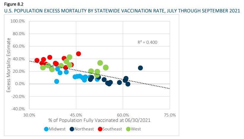
That nobody at one of the world's elite applied statistics organizations even mentioned the possibility of the HUB or the ecological fallacy (an extremely common bias in aggregated statistics) is inexcusable. Heck, they even give us pictures like the one above in which their own coloring of the dots define regions with obviously different (almost flat) trend lines compared to that of the aggregate!
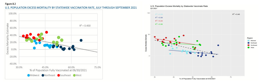
Within each region, which accounts for group health and demographic differences, we see almost no sign of VE whatsoever. The rest is easily explained (as per prior articles) as HUB effects.
Now, let's be more plain. Here is the state level excess mortality data as per the CDC, but with the third quarters of 2020 and 2021 side-by-side.
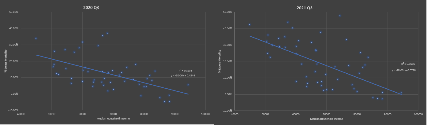
Yes, the slope is slightly sharper in 2021, but it was already present in 2020. And in 2021, we saw massive increases in obesity and diabetes among the nation's lowest quartile population—not to mention a sharp increase in drug overdoses (fentanyl in particular).
I previously threw together (overly quickly) a lesson on understanding scatter plots based on my reanalysis of the SOA data that some fraction of readers will be at the right point in their education of statistics to learn from.
Honestly, shame on the SOA for correcting neither for the obviously low hanging fruit of the ecological fallacy, nor the HUB. I mean, FFS, put down the status-meter, stop rubbing your paycheck against your privates, and step away from the killer clown show.

"Case fatality rates declined."
There are debates over whether different variants were more or less deadly, though a lot of the differences in case fatality rates (CFRs) have been due to shifting demographics of the infected (at least measured by positive PCR tests). For the most part, CFRs have plummeted during the pandemic, and this is primarily due to several identifiable factors: (1) the nursing home patients died early during the pandemic and went from a high to a low proportion of deaths categorized as COVID-19, (2) while very few young people got sick during 2020, those numbers ramped up in 2021 and 2022, and (3) the unvaccinated were prodded to test more often most-vaccination in order to get on with life.
Additionally, testing rates clearly manipulate CFR. We saw that in action during the vaccine rollout.
The discussion of the CFR collapse clearly falls to a tertiary form of evidence that does not at all contradict the substantial evidence that the mild observed VE is purely illusory.
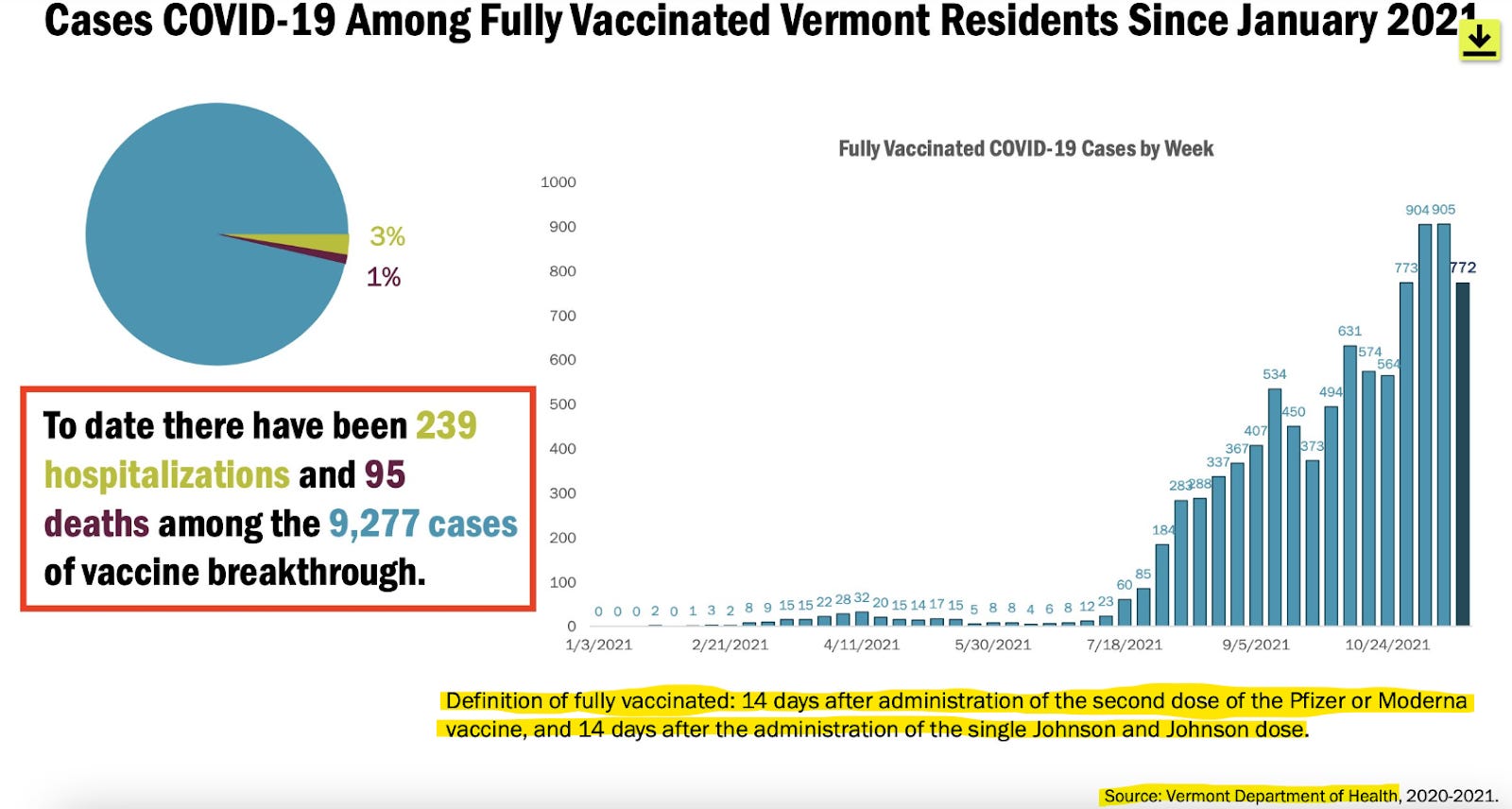
However, it is worth noting that the second-most vaccinated state, Vermont, saw CFR go up, not down, during 2021.

And if you want the best sense of how vaccination made an impact on CFR, it is still the first weeks after rollout where you'd want to look. Unlike in the U.S., Europe did not broadly change testing protocols during vaccine rollout, and we can see that CFR spiked there dramatically.
"But the vaccines make cases less severe."
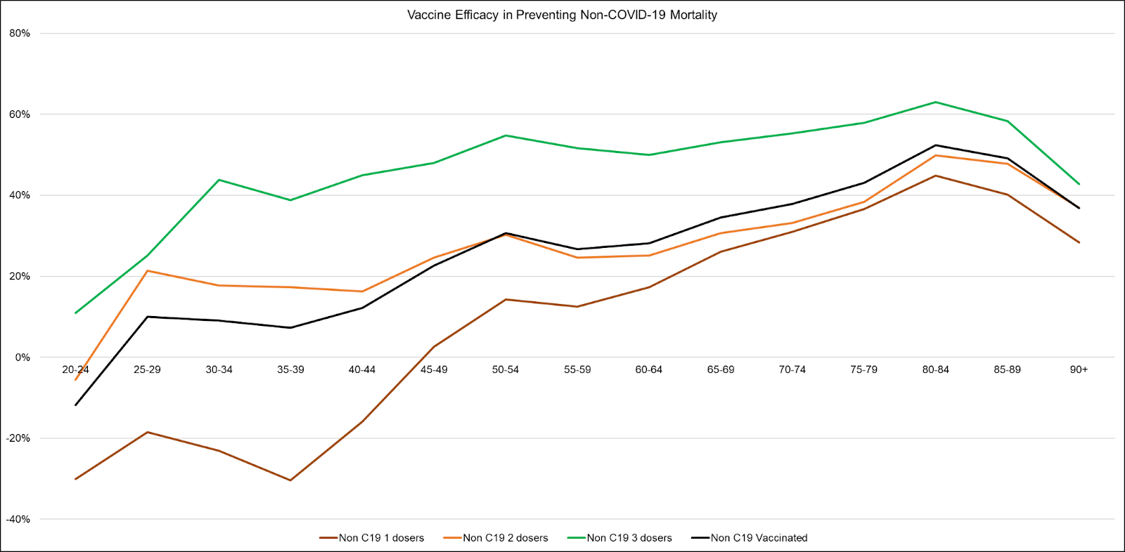
A good principle for unearthing data with the least amount or number of present biases is to seek out data from highly similar cohorts. During my work with the DMED (military health database) project, I combined a couple of queries to produce this chart showing that hospitalizations per COVID-19 case jumped dramatically during 2021—peaking just prior to the mandate deadline in August of that year.
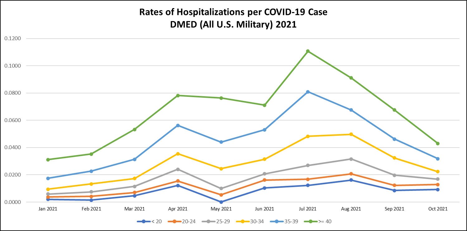
This is one of the few charts you will ever see with tight age bands of a substantial population with roughly similar health and fitness characteristics. There is no major ecological bias, and no major HUB bias. Severity of disease per case simply grows right into the August mandate deadline for the military, which is now over 90% vaccinated.
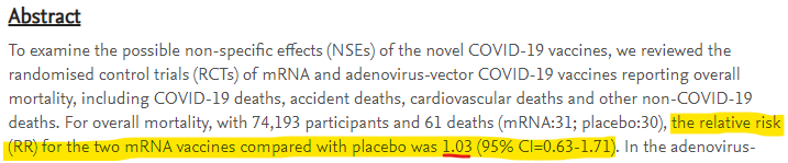
Understand also that through the full time period of observation in the mRNA vaccine trials, there was no mortality benefit to receiving the experimental gene therapy injections (Benn et al, 2022).
"Then why is it that Republicans die more, genius?"
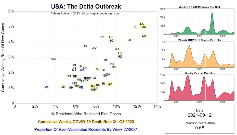
It is true that counties that vote Republican in presidential elections have more COVID-19 deaths than counties that vote Democratic in those elections. Those counties also have older populations, and have higher mortality rates in general, so HUB should be our prima facie goto explanation. We covered most of this when we dismantled the SOA report. But I will add an additional argument that comes from the great work of Fabian Spieker whose novel focus on the first derivative of newly vaccinated patients shows red states take off in delta wave infections, while the overall trend is a positive correlation between first vaccinations and new cases. This correlation increases throughout the delta wave.
Do you ever just get the feeling that there is somebody whose job it is to twist and contort every prismatic data illusion in the Matrix to make people hate one another?

From The Atlantic article,
No country has a perfect COVID-vaccination rate, even this far into the pandemic, but America’s record is particularly dismal. About a third of Americans—more than a hundred million people—have yet to get their initial shots. You can find anti-vaxxers in every corner of the country. But by far the single group of adults most likely to be unvaccinated is Republicans: 37 percent of Republicans are still unvaccinated or only partially vaccinated, compared with 9 percent of Democrats. Fourteen of the 15 states with the lowest vaccination rates voted for Donald Trump in 2020. (The other is Georgia.)
And the demeaning summary:
If the issue is indeed systemic, that doesn’t bode well for the future. Other factors could explain the higher death rate in Republican-leaning places—more poverty, less education, worse socioeconomic conditions—though Woolf said he isn’t convinced that those factors aren’t related to bad state health policy too. In any case, the long-term decline of health in red states indicates that there is an ongoing problem at a high level in Republican-led places, and that something has gone awry. “If you happen to live in certain states, your chances for living a long life are going to be much higher than if you’re an American living in a different state,” Woolf said.
The Atlantic fancies itself a publication for educated people, but every one of the geniuses who love to denigrate Trump's less educated voters somehow simultaneously failed to imagine and correct for any HUB, WUB, EUB, or the general ecological fallacy. Huh. No wonder the U.S. is on the verge of Balkanization.

Since the 1960s, the American cultural split has gradually sorted income status into party status, with the Trump era cementing that shift. I have myself pondered whether that latter part was engineered—possibly even with the Plandemonium in mind (think it through, and make up your own mind, of course). Sorting income into political parties is the perfect way to hand the Mandarin class an excuse to hate the working class. "Of course it's not because they're poor. They're only that way because they're stupid poopy white supremacists."
But, Muh Trials…95% PROVEN!
I could sit here and poke fun at people who trust public health authorities and Big Pharmafia all day, but the topic is serious, so I'll save my snark for another article. I'll just lay out some facts to help people still under the spell of corporate trust:
The 95% number was based on testing for mild symptoms in conjunction with a PCR positive test (without checking for vaccine confounding of the PCR protocol) in largely low risk populations. But the trials did not result in lowering mortality (Benn et al, 2022). They weren't even powered to do so, statistically speaking, and the control arms were quickly vaccinated to cut off observations of accumulating HUB effects. We really should ask whether that was intentional.
This is an industry known for engineering trial fraud. I've taken the time to put together some helpful details specific to the COVID-19 vaccines.
I do not mean this to be another jocular jab (excuse the pun) because the grotesque propaganda campaigns thrust at all of us are extraordinarily cruel: I really am sorry if you were fooled by a massively profitable propaganda campaign that even involved mercenary tactics like strong-arming foreign governments into putting up sovereign assets as collateral for vaccine liability. But it's time to wake up. The fate of millions or even billions of people depends on getting this right.

Once you understand the data, and it settles in your mind that intramuscular vaccination makes little sense against respiratory viruses, coming to grips with the horrors of the scams can be an exercise in fighting the friction of cognitive dissonance. If you're on the fence, find a moment when you can relax, meditate into an alert state, and soak up vaccinologist Peter Hotez.

Ivor calls him evil. I don't feel the need to tell you what to think.
In fact, I won't even tell you whether or not you should have your children injected with [INGREDIENTS REDACTED]. That's your responsibility. It's on you. Unless you think you've been actively misled.

Source: Rounding The Earth


Comments
Post a Comment