UK Data Shows No All-Cause Mortality Benefit for COVID-19 Vaccines
UK Data Shows No All-Cause Mortality Benefit for COVID-19 Vaccines
The Vaccine Wars Part I
The original title of this article was, "Did Alex Berenson Fall for a Simpson's Paradox?" I'm rewriting the title and introduction to this article after having finished an analysis that demonstrates no all-cause mortality benefit to the vaccinated in the UK. You'll have to read through the story to understand why.
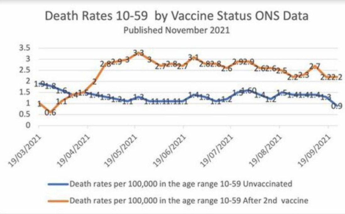
Are the vaccinated dying at two-to-three times the rate of the unvaccinated in the UK as Alex Berenson's recent article suggests?
Let's be clear: Alex Berenson has done an excellent and courageous job during the pandemic. I follow his work and recommend that you do as well. He definitely digs into data better than most journalists, though we should not expect for him to do everything and be everything. He doesn't have to be perfect and you don't have to agree with every take to understand how important his work is. I am writing this before I analyze the data. However, I will note that my first instinct is to think that the [twice] Vaccinated cohort has an older age profile than the Unvaccinated cohort. Thus, we should expect to see greater all cause mortality in that group. This means what we are seeing is an illusion of data aggregation often called a Simpson's paradox, something I've written about several times before (here and here).
If you don't want to read through my discussion of this particular statistical illusion, skip down to the next section to read the conclusion.
Let's be clear: I've seen statisticians and Wall Street quants at the highest levels fall for a Simpson's paradox here or there. Recognizing the way an aggregate can or should be disentangled is a different job than just doing the statistics. It often takes domain knowledge (and humility in reining in expectations) in addition to statistical awareness to spot a Simpson's paradox. Reversed trends in aggregates have probably fooled every human that walked the planet at one point or another, assuming they were numerate enough to view any data at all.
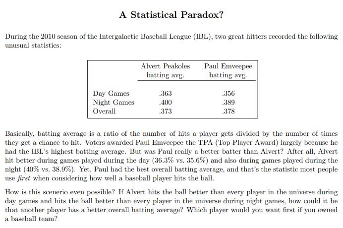
When I teach my Combinatorics, Probability, and Statistics courses, I stop and spend 10% of every course at every level on Simpson's paradox's and similar conditional data twists alone, giving students a chance to noodle over the strange "contradictions" in the results. This is from curriculum I've used with students ages 10-70:
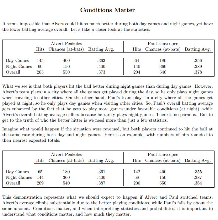
This story is based on circumstances similar to those I've personally witnessed in baseball statistics. Here is the punch line: Peakoles is clearly the superior hitter (at least so far as batting average is concerned):
I spend so much time in class focusing on this kind of paradox and conditionality in probability and statistics for several reasons:
I want for students to understand that problems aren't always straight-forward.
Understanding these problems is the difference between an elite professional data geek and somebody with enough knowledge to be dangerous (which appears to be the substantial majority of the medical profession and all but the most elite epidemiologists during this pandemic).
We may reach a point at which having more problem solvers trained in teasing apart this kind of data results in millions of lives saved and hundreds of billions or even trillions of dollars saved annually in recovered lost productivity associated with poor management and governance decisions.
Modeling the UK Data Shows No All-Cause Mortality Benefit
I wrote the first half of this article prior to modeling the data.
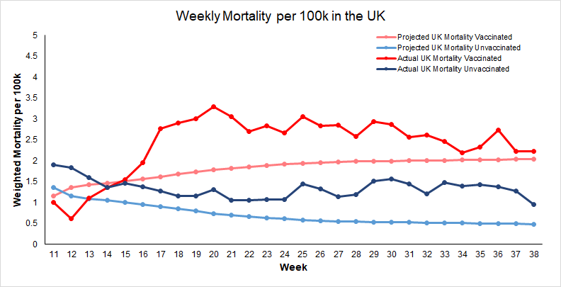
I took the period mortality tables from the UK's Office of National Statistics (ONS). Next, I painstakingly (yuck) estimated every relevant point on the cumulative vaccinated chart by age from the UK's vaccination surveillance report, using some reasonable interpolations along the way. Then I realized that I needed population proportions for the subgroups of the age 10-59 cohort (Can we get a little granularity, please? Or just open source data?). Now, I can put together a projected mortality profile for each group during an ordinary year using weighted averages (where each age group's projected mortality gets multiplied by its proportion within each cohort, and the results are summed) for each week.
I then took the raw data Berenson pointed to out to one more decimal place, and plotted the actual 2021 all cause mortality data versus the expected all cause mortality data. As we can see, the Vaccinated cohort, due to having a generally older age profile, was expected to have higher all cause mortality. (Lighter hues are projected, heavier hues are what actually happened.)
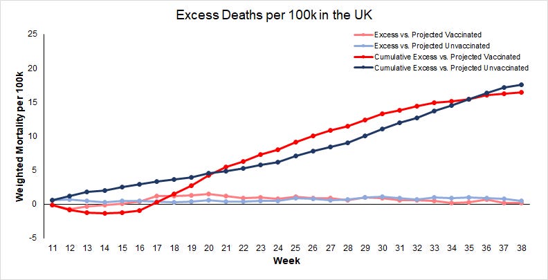
So, Alex was wrong to suggest that the data showed prima facie higher mortality in the Vaccinated cohort due to the vaccines. However, this result is quite interesting! It's hard to look at these graphs and easily determine which cohort has suffered more excess mortality during the middle months of 2021! So, I took the excess mortality from each cohort for each week, and also cumulatively, and plotted them:
The cumulative trends go back-and-forth, and it seems reasonable to dismiss any difference as statistical noise. But when we do compute the tiny overall observed benefit at the end of the 28 week stretch to the vaccinated group, it amounts to a mere 5 deaths per million doses (at over $6 million per life saved).
I wonder who could have predicted all this?
Also, understand that the single dose all cause mortality rates in the 10-59 range were higher than for either of these cohorts, which is to say that the Unvaccinated cohort is doing just a tiny bit better than the average UK citizen during this time span! This is all very consistent with my hypothesis that the vaccines have no real efficacy. Even worse, they have come at the expense of hundreds of thousands of serious adverse events in the UK alone (possibly over a million at this point), and several billion pounds from the public treasury.
It's also unclear exactly how the laundering of post-vaccination mortality plays into official mortality categorizations, but the charts above are made playing by their rules, with their data. All this provides us with a frightening, if illuminating look at what the Kunlangeta are doing during (provoking?) an international governance and economic crisis.
Addendum: Note that I still think there are excess deaths among the vaccinated group not visible in this time frame because they occurred en masse at the outset of the UK's vaccination program among the elderly. It certainly appears that these vaccines are killing more people than they save.
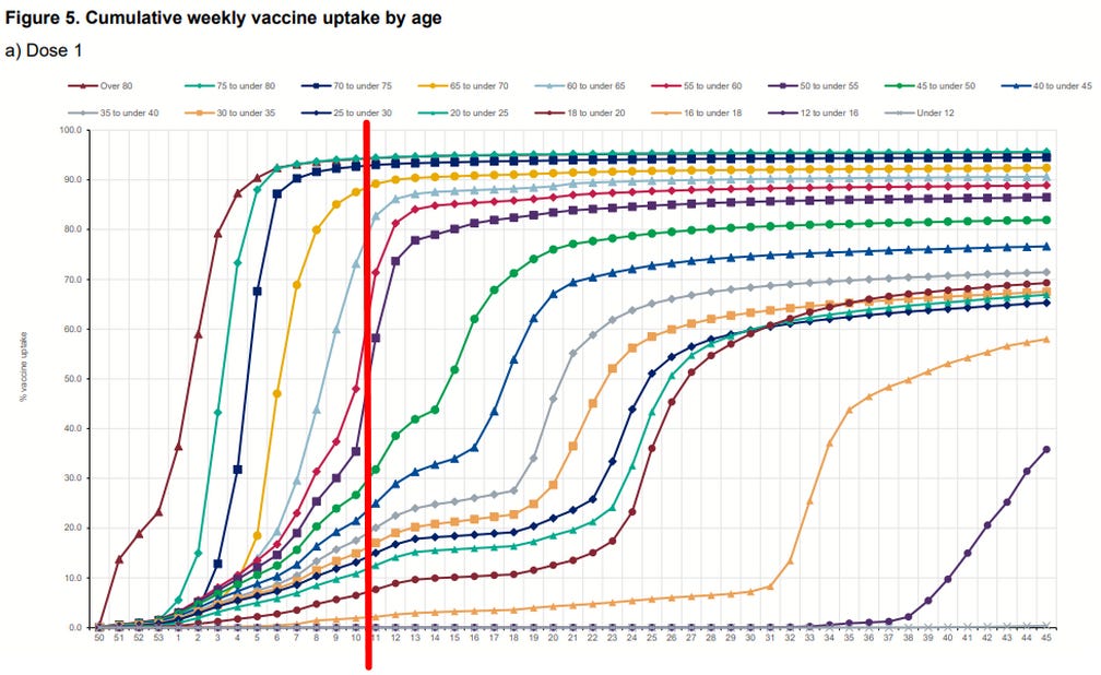
Addendum 2: In response to a question on Twitter…from March 13 and for several months, the oldest among the 10-59 age group get vaccinated faster (think in proportions), while the youngest get vaccinated slower, which is why the age profile of the Vaccinated cohort grows (and the Unvaccinated gets lower). Hopefully this visualization helps.
Addendum 3: Note that the 10-16 year olds remain almost entirely unvaccinated through week 38. As the older groups shift into the Vaccinated cohort, this distills a lower mortality rate among the Unvaccinated cohort.
Comments
Post a Comment