When Were New Yorkers Who Died as Hospital Inpatients in Spring 2020 Admitted to the Hospital--and Why Does It Matter?
When Were New Yorkers Who Died as Hospital Inpatients in Spring 2020 Admitted to the Hospital--and Why Does It Matter?
The one numerical dataset I'd like to have more than any other

If I could get only one numerical dataset for the New York City mass casualty event in spring 2020, it would be
the hospital admission dates for every in-hospital death recorded between September 1, 2019 and May 31, 2020.1
Because I would really, really like to know what proportion of deaths were people already in the hospital when the emergency period began.2 The same data for U.S. as a whole — and for Bergamo, Madrid, London, Manaus (Brazil), and anyplace else that reported an incredibly fast and high mass-death toll in those weeks — would be also be nice to have.
What makes that data so important, in my view?
Think back to early 2020: Officials and dashboards gave everyone the impression that a significant portion of the “coronavirus” deaths being reported were people who suddenly became ill and went or were sent to the hospital. For New York in particular, that perception is hard to square with the drop in hospital activity and bizarre ambulance dispatch data. Fewer people coming in, yet more people than ever dying suggests that patients who had been inside for weeks were among the dead.
If, for example, 30%-40% of the increase in NYC hospital inpatient deaths were people admitted in January or February, it presents a serious challenge to claims about a sudden-spreading deadly pathogen.3 Anyone asserting that the pathogen got into NYC hospitals and wreaked havoc on existing patients like no place else in America would be pretty hard-pressed to explain how all of the “infection control” mechanisms from hazmat suits to cordoned-off COVID ICUs were defenseless against an unremarkable coronavirus that showed itself in no data of any kind until the deployment of testing.
Even those who believe that a virus-bomb was detonated or a “bioweapon” point-released in America’s densest and most-populous city should want to know when those who died in hospitals arrived.
More than 15,000 “extra” inpatients expiring in eleven weeks (a 266% increase over baseline) is a cataclysmic event. The world deserves to know how many existing patients were “bombed” - regardless of what the bombs were - so that such an event can never happen again. Without the specter of mass death in hospitals and nursing homes, the populace could not have been convinced a shot was needed and that illegal quarantines & closures were a reasonable “response” to an “invisible enemy.”
New York Versus Everybody
A reason to care about date-of-admission for New York’s dead patients in particular has to do with deaths rising there more quickly and to a higher magnitude than other places in the U.S. - and being entirely disproportionate to the population.
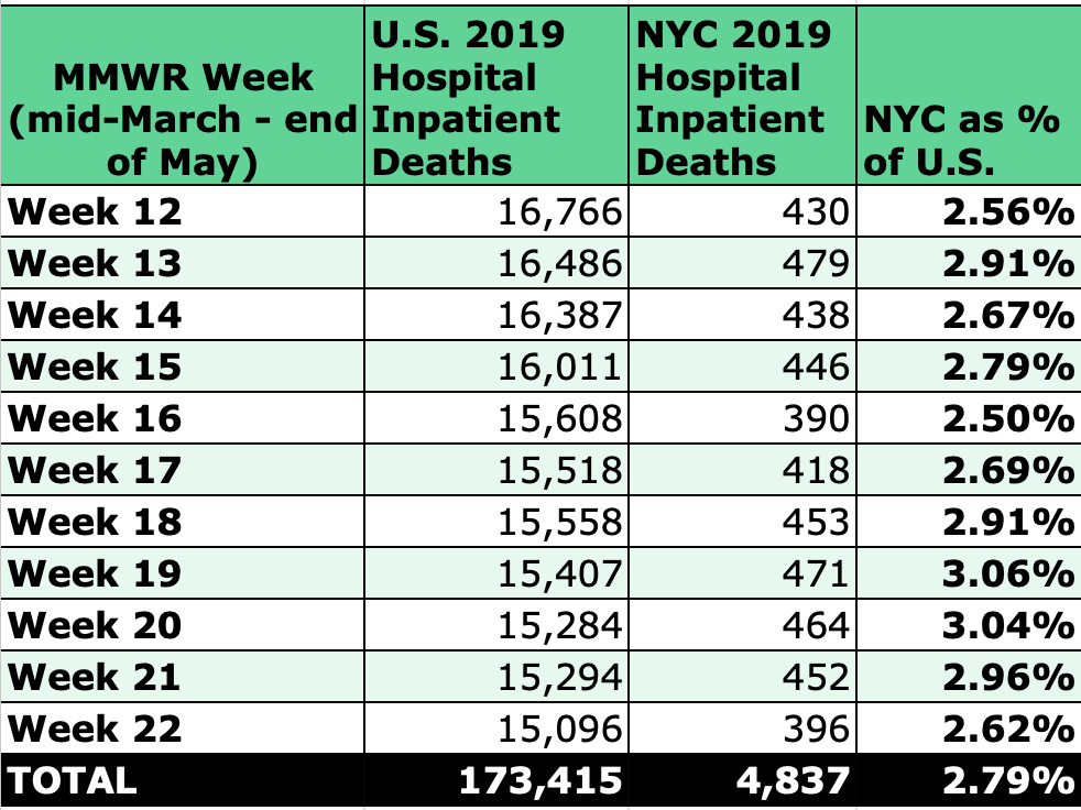
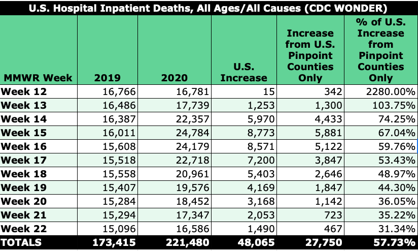
The departure from normal ratios is astounding. For weeks 12-22 in 2019, the five boroughs comprised 2.8% of all U.S. hospital inpatient deaths, which mirrors the proportion of NYC’s population to the U.S. population.
Table 1
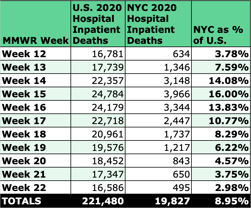
For the same weeks in 2020, the 15 Days to Slow the Spread announcement triggered increases that pushed the proportion to a whopping 16% before dropping back to baseline by the end of May.
Table 2
(It goes without saying, but the idea that NYC hospitals went from ~450 inpatient deaths a week to thousands week after week defies credulity from a body management standpoint alone. Adding deaths in hospital emergency departments makes the number even more ridiculous.)4
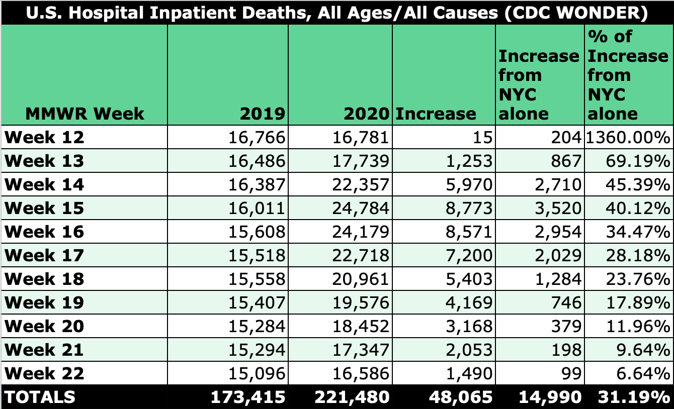
Now look at the increase in U.S. hospital inpatient deaths alongside how much of that increase was from NYC only, and the Big Apple’s big part in the push to keep the country shut down becomes more obvious.
Table 3
Including counties in the greater NYC area, we can see that whatever was happening with U.S. hospital inpatient deaths was largely confined to a specific part of the country.5
Table 4
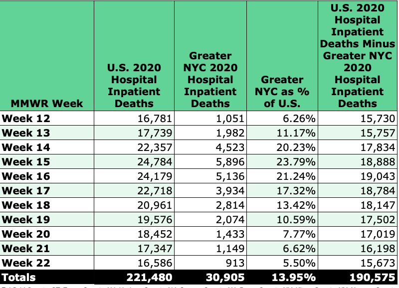
Source: CDC WONDER | Counties: Fairfield County, CT; Essex County, NJ; Hudson County, NJ; Sussex County, NJ; Bronx County, NY; Kings County, NY; Nassau County, NY; New York County, NY; Queens County, NY; Richmond County, NY; Rockland County, NY; Suffolk County, NY; Westchester County, NY
“Pinpoint Pandemic” Counties versus U.S.
Adding some other “pinpoint pandemic” counties for areas such as Detroit, Chicago, New Orleans, and (for raw-number contributions) Los Angeles shows how geographically disperse the concentrated the hospital death events were — so much so that no uniform argument about population, demographics, climate, or density can be reasonably applied. It also illustrates how participation from every hospital system in a country is not needed to kick off and sustain a staged pandemic.
Table 5
Selected “Pinpoint Pandemic” Counties: Los Angeles County, CA; Fairfield County, CT; Cook County, IL; Jefferson Parish, LA; Orleans Parish, LA; Wayne County, MI; Essex County, NJ; Hudson County, NJ; Sussex County, NJ; Bronx County, NY; Kings County, NY; Nassau County, NY; New York County, NY; Queens County, NY; Richmond County, NY; Rockland County, NY; Suffolk County, NY; Westchester County, NY.
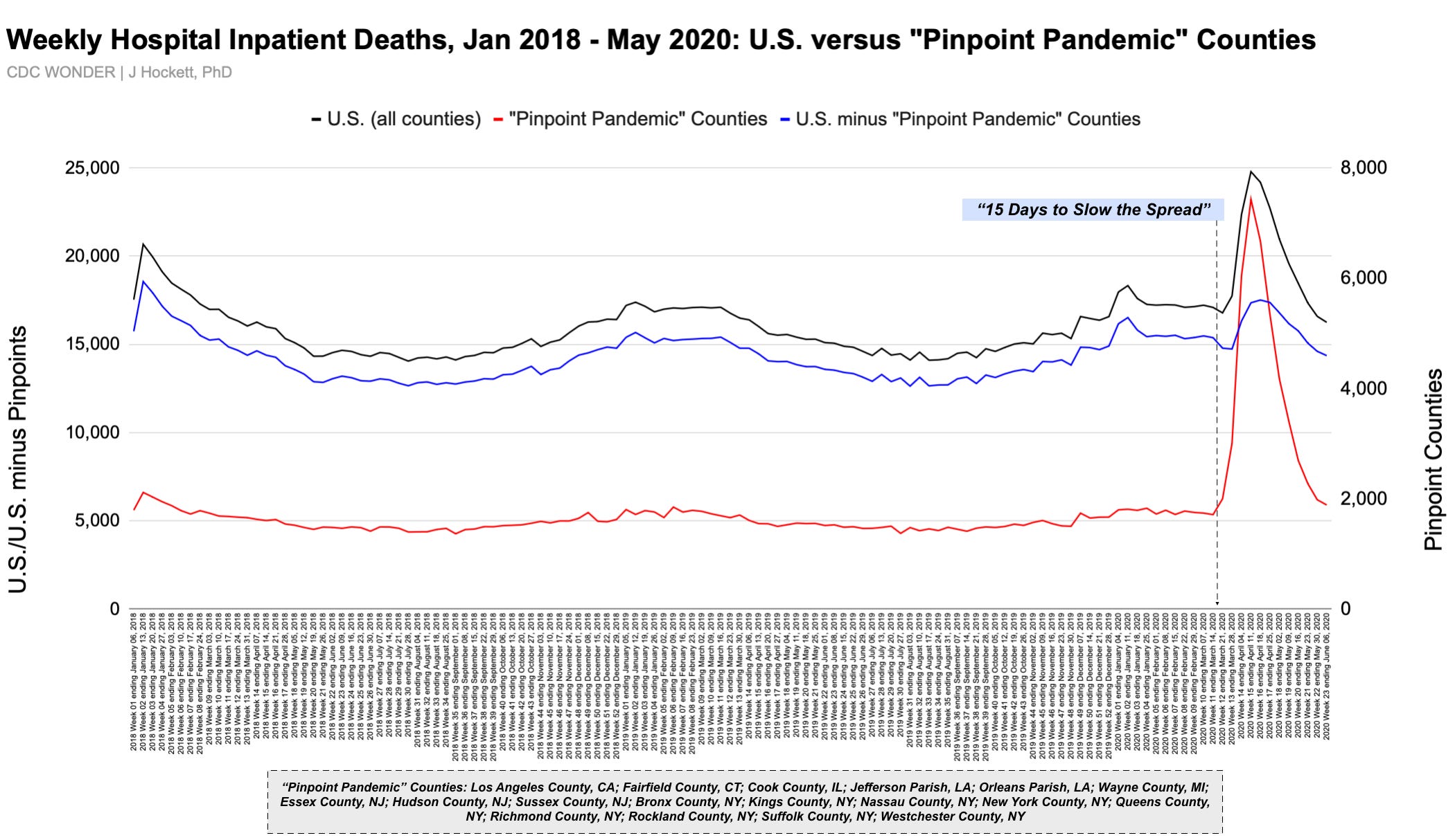
A time-series graph of weekly hospital deaths in the U.S. for January 2018 through May 2020, with and without certain “pinpoint” counties, makes clear that something very unusual occurred — something that’s pretty hard to explain given that no hospital system in the country shows a marked or unprecedented increase in people coming to the ER. Who in the world were all of those inpatients? Why did they come to the hospital — and when? How were they treated, and for what?
Figure 1
Popular explanations for New York City’s staggering hospital inpatient toll like ventilator use and remdesivir don’t work with available data, and officials are still hiding how many nursing home residents died in hospitals during the spring 2020 event.
Knowing how many “coronavirus dead” there & elsewhere went into the hospital before the Feds decided there was an emergency wouldn’t answer every “What the heck happened?” question, but it would be a step toward corroborating the government’s claims about at least one city’s event that appears fraudulently presented, if not illuminate what did & didn’t occur everywhere else.
CORRECTION TO FIGURE 1: Labels for red and blue lines were mistakenly swapped in original post.
I’ve explained elsewhere my failed attempts to get that data.
The first time the possibility of existing patients comprising a significant portion of hospital death toll popped into my brain was on October 28 2022, during an email exchange with a medical doctor. I said, “Just had a thought, after looking at this and other NYC data. Is it possible that the massive hospital death toll in NYC wasn’t largely new admits but people who were already there?”
Or before January 2020 — which sounds crazy, but if there are deaths which were “pushed forward” from the past into the spike, admission dates for those deaths may be months earlier.
Remember, FEMA trucks were under-used as mobile morgues and FEMA funeral assistance data fall short of being able to substantiate the toll.
Boston and Philadelphia could be included as well, although their raw-number contributions are somewhat lower.
Source: Wood House 76


Comments
Post a Comment