On the impact of the vaccines on non-covid deaths [Part 2]
Did the vaccination of those least likely to die also affect with-covid deaths?
We’ve seen in the previous post that it appears that the impact of vaccination on non-covid deaths appears to be caused by a decision to not vaccinate those who were most likely to die; these individuals were concentrated into the small group of unvaccinated, making their average mortality markedly worse than that of the vaccinated.
But what about covid deaths? Were those who were very ill and likely to die soon more likely to die with covid? I see three mechanisms which might cause this to occur:
We are talking about deaths with covid. Some of them might have caught covid near to the point of death anyway.
They were frail — thus if they caught covid it might be more likely to kill them. Thus the effect of covid might have been to bring their deaths forward by a month or two.
Those close to death generally have many interactions with healthcare staff, and might even be in hospital. We know that there were many cases where the individual caught covid while in hospital for something else. This might have increased their risks of death with covid.
So there are mechanisms that might push some of those deaths that were coming anyway into the with covid statistics.
Before I get to the data, let’s first consider what we’d expect to see. Consider last winter’s covid surge —covid comes in waves and whatever the personal situation it will be more likely to be caught when there is more of it about. Because of the concentration of the infectious pressure into the first few weeks of January we wouldn’t simply expect to see a mirroring of the deaths data shown in the previous post. Instead, I’d suggest we should see is most deaths during the covid wave, but with the deaths pushed out to later weeks for the younger age groups as they were vaccinated later.
I’ve produced some graphs to illustrate the actual data. Note that the graphs follow the same convention as shown in the last post, except that I have truncated timescales to focus on the first covid wave (the graphs now show data from the 1st of January to the 23rd of May rather than to the 24th of September) and I am not showing deaths data for the second dose (as the second dose was only rolled out in numbers in week 12 even for those aged over 80).
First those aged over 80 (ie vaccinated first):
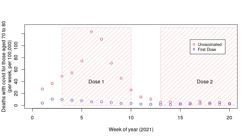
Those aged 70 to 80 (vaccinated second):
And those aged 60-70 (vaccinated third):
I think we might be seeing an effect here.
From what we know about last winter’s covid wave in the UK, cases in the UK peaked in the first week of January. Deaths lagged by a few weeks, peaking in week 4. This appears to be reflected in the unvaccinated data shown in the first graph above for those aged over 80. There’s also a rather slow decline out to week 9. It looks like the peak is coincident with where it is supposed to be (a few weeks after the peak in cases), but that the decline in deaths is extended — does this reflect the concentration of those most likely to die within the unvaccinated group?
The deaths data for the unvaccinated aged 70 to 80 appears to have a slower rise and a delayed peak, with the most deaths occurring around week 6. The decline in deaths is also extended, this time out to week 11 or so. Note that there’s little reason for the delayed peak — the 70 to 80 year old population was exposed to the same population-wide explosion in cases last January as everyone else.
The deaths data for the unvaccinated aged 60-70 is a little more complex to explain. This appears to show a peak near week 3 and then a steady decline all the way to week 20 and beyond. The slow decline in cases is as we might expect, but we’re not getting a delay in the peak. But note the actual peak in the data occurs before that age group were vaccinated in any numbers — I believe what we see in that chart is a peak and decline up to week 5, before the vaccinations started in this age group, and then a mild increase in cases into a very broad second peak as the ‘concentrate the most likely to die in the unvaccinated group’ effect started to take hold.
Maybe this ‘twin peak’ applies to the other data? I really can’t see it in the data for those aged over 80, but the curve for those aged 70 to 80 looks a little strange — is what we see in this graph a mild rise in cases around week 3 to 4, followed by a second much larger peak that dwarfs the peak expected for mid January and completely eliminates its expected decline — if this is the case then the ‘concentrate the most likely to die in the unvaccinated group’ effect is particularly important in this age group. Or perhaps I’m over analysing it…
Similarly, is the peak in the deaths for those aged over 80 that remained unvaccinated also comprised of a lower number of deaths in those not close to death, but with the higher peak of those close to death superimposed on top — after all, we saw the peak for non-covid deaths in those unvaccinated in this age group at around week 4 (see previous post). We certainly can’t know this because the data is only available for this group as a whole, but looking at the data for those aged 60-70 and 70-80 it certainly is plausible.
Regardless, I’ll note again that there’s no reason for the age dependency in the delay in the peak or the rate of decline in deaths after the peak in cases; the peak in covid cases in the first week of January 2021 was population wide and all age groups will have had the same changes in their probability of infection as the weeks went by, with a few weeks of delay from the peak of infection risk to the peak of mortality risk.
So, does this show that the covid deaths data were affected by a concentration of those most likely to die into the unvaccinated group? Well, sort of. What we don’t have here is conclusive proof that it has occurred — but I’d suggest that we do have a very strong indication that this might have been occurring, and thus that the official estimates of the effectiveness of the vaccines might have been biased to suggest that they were performing substantially better than they actually were.
What is needed now is for some further research to be undertaken by the ONS to investigate whether this effect was occurring and what impact it would have on the vaccine effectiveness estimates. However, I very much doubt that this will occur; for some reason governments around the world are very hesitant to do any investigations that might show the vaccines in a worse light.
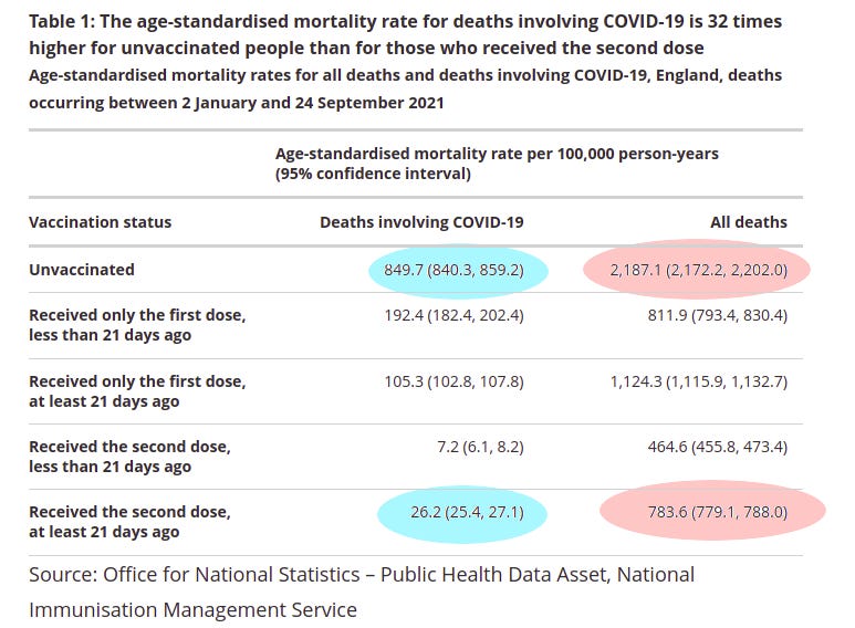
So, back to the summary table from the original ONS report:
Our analysis now suggests that not only is the all deaths data suspect (pink highlights) but also the with covid deaths (light blue highlight). The ONS suggested that the vaccines have reduced with covid deaths by over 30 fold — based on our analysis I don’t think they’re performing anywhere near that well at preventing death.
One final thing… Note the specific words in the table above — age-standardised mortality. What does this even mean? I’ll cover this in a future post, but for now I’ll leave you with a teaser using the words of Inigo Montoya: I do not think it means what you think it means.


Comments
Post a Comment