lying with statistics: US all cause deaths edition
lying with statistics: US all cause deaths edition
crossing out cross correlations and getting to the meat of the matter
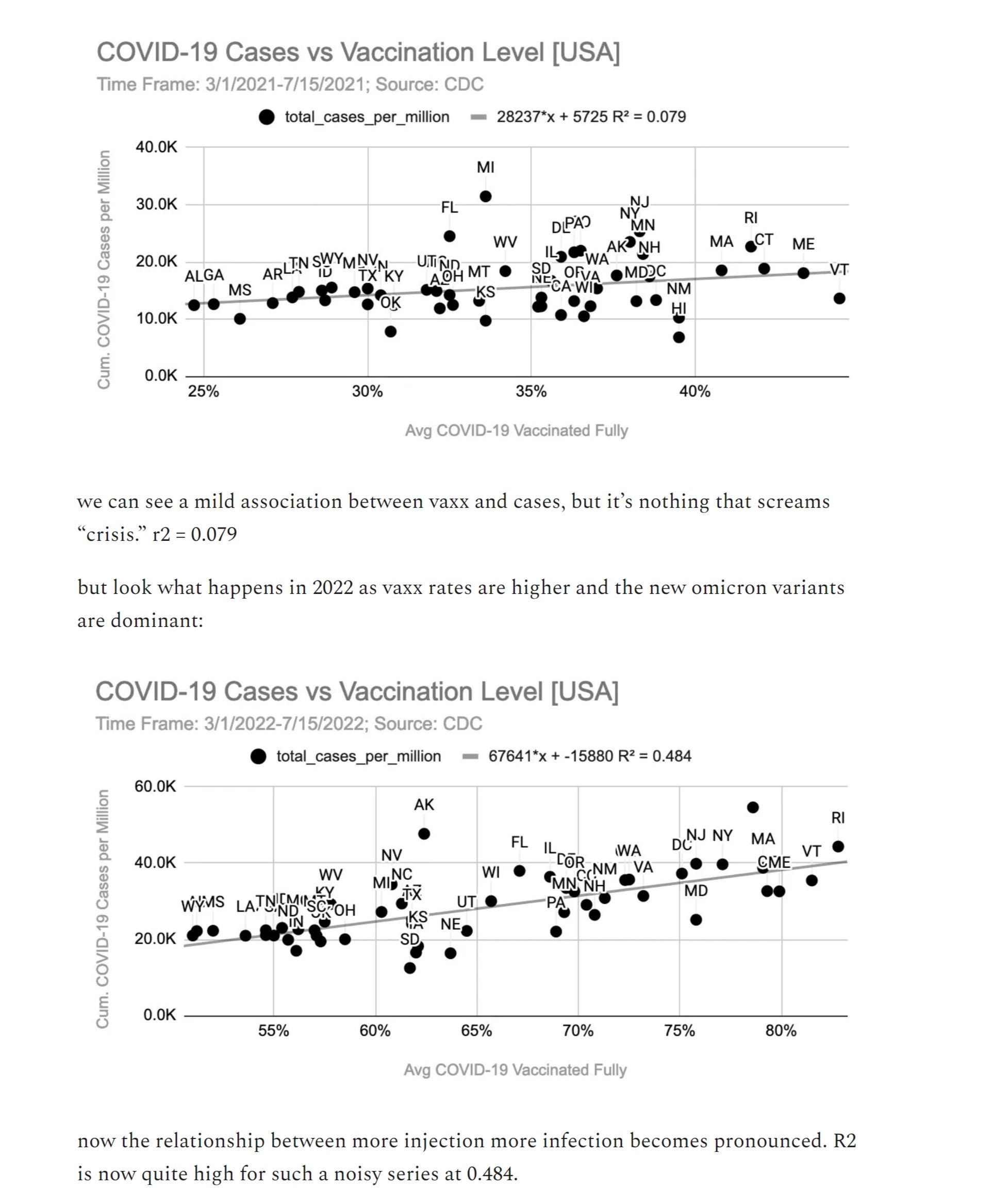
it has recently come into vogue to try to use US state scale data to prove that covid vaccines have all cause mortality benefit.
much of this appears misleading and there looks to be a lot of confusion about what some of this data means and how to read it, so it seemed like a good time for another edition of “stats with cats” to see if we can’t get to the bottom of it.
let’s look:
this argument, an example of which is made here by associate econ professor micah pollak, rests on correlations from data.
it’s precisely the kind of argument that looks very compelling at first blush but is, in fact, complete fallacy. (in fact, several fallacies)
can you spot the errors?


if you said “correlation is not causality” that’s a good start.
if you said “there is no base rate or control group and this dataset is neither randomized nor matched by risk factor” go to the head of the class.
the problem with correlation is that it cannot, by itself, prove anything. any econ professor should know this so micah is either being extremely sloppy or seeking to mislead.
there are about 100 relevant cross correlations: age, obesity, diabetes, access to medical care, etc. this has enormous effects on outcomes.
and “excess deaths” as used by micah is using a pre-covid baseline to assess a post covid world in which all these effects pertain.
it’s like using a nighttime baseline to assess daytime warming.
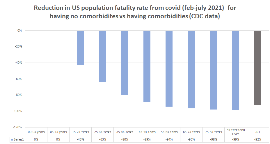
i made this chart (full calculation and data HERE) about a year ago.
overall, presence of comorbidity is associated with a greater than 10X expression of death as an outcome.
this has long been known.
and there is strong clustering of high risk factor prevalence and low vaccine uptake.
this becomes incredibly obvious when you pull the correlations.
here is US states by vaxx rate plotted against obesity rate.
notice anything?
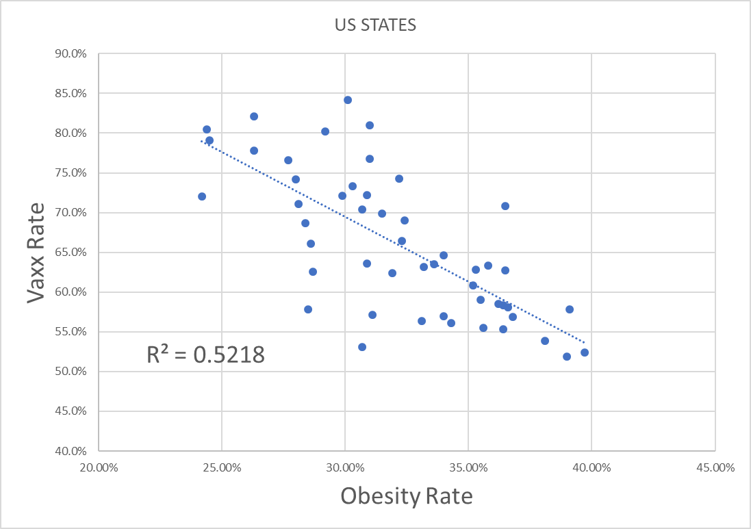
this R2 is even higher than micah’s.
you can predict 52% of vaxx rate by obesity rate.
obesity rate also correlates to higher covid deaths and to about 20 other risk factors like diabetes and hypertension.
here’s another telling cross correlation (and an odd omission for an economist): wealth.
similarly, the life disruptions and career damage have been much higher in the working poor than the laptop classes. those with less income also tend to have less access to medical care.
and income level predicts vaxx strongly.
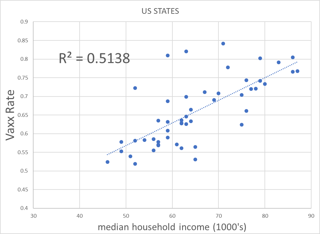
and, as the cross correlation with these two variables is strong, we get into very tough territory to tease a signal out of using a method as unsophisticated as simple correlation on vaccines and all cause deaths.
many of the least vaxxed are also the most obese and poorest.
we’re not comparing anything remotely resembling like to like.
the analysis presented by micah might be appropriate for a well controlled, randomized trial, but this ain’t that.
there is obviously quite a lot more going on here than just jab variance.
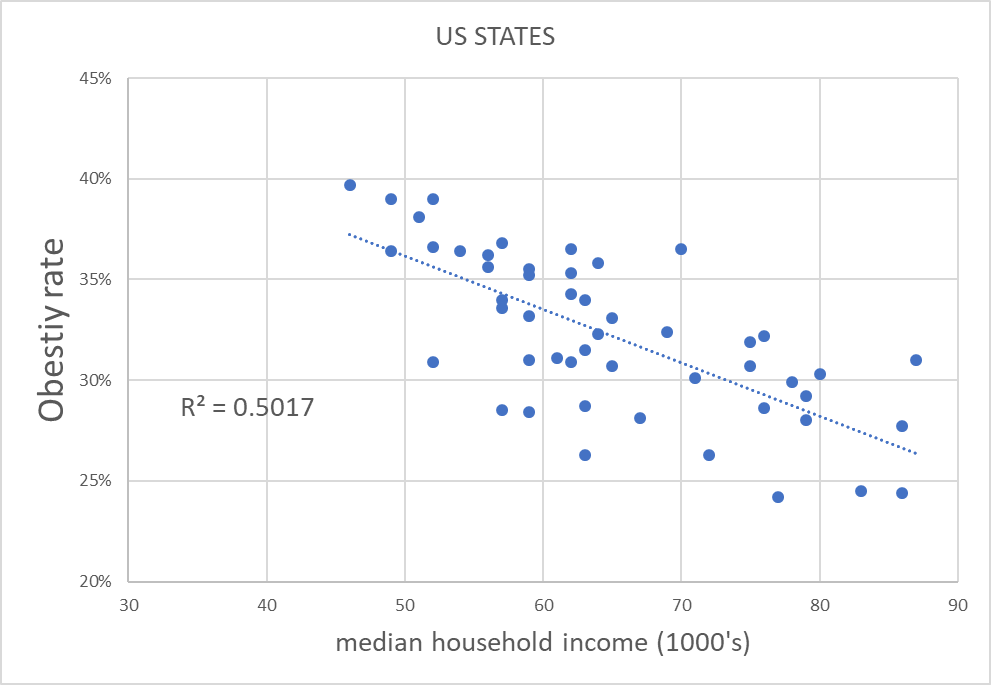
diabetes (probably the worst of the covid risk factors) in particular is known to have gotten seriously out of control during covid and has strong cross correlation to obesity and state income level. (.49 and .34 R2 respectively)
these are strong relationships with known or strong reason to presume high causal effect.
to ignore them seems like an omission that will irretrievably taint this analysis.
this is telling you that professor pollak’s claims are almost certainly spurious.
it’s telling you that neither we nor he can have any idea what he is measuring.
(also, as many of these R2’s are higher than his 0.4, it points the the possibility that on a like to like basis, the relationship micah presents may actually invert)
this is why you have to be VERY careful trying to use correlation to prove causality in non-balanced and non-randomized data. (it’s also why the RCT structure exists: to control for and root out exogenous and extraneous cross correlations like this.)
addendum: a reader points out that the timeframe chosen by micah is a significant cherry pick and i think this is correct.
it starts in june 2021, just as the peak southern seasons for covid commence and runs to now. this will mean that the southern states (which are lower vaxx rate) will contain 2 peak covid seasons vs only one for the highly vaxxed north. failure to normalize this series for seasonal expression is a severe issue.
this badly salts the sample.
thanks to t coddington for pointing this out.
so how COULD we go about assessing this?
we need a control group and the best control group to use in a case like this is the states themselves, or better still, the counties so that we can get better granularity.
their ages, demographics, incomes, seasonality, etc all remain fairly constant.
before doing a huge pile of work on such issues, it always pays to first see if someone else has already done it and as fortune would have it, they had.
first we go to this wonderful analysis by longtime gatopal™ and idea vetting amigo ethical skeptic whom i suspect many of you know.
here’s what a real analysis of this topic looks like.
(spoiler alert, it’s not supportive of the “vaccines saved lives” thesis.)

the premise is simple: vaccine effects cannot travel back in time so if we take 2020 and plot it we can get a baseline by county for the US covid deaths. as can be readily seen (dashed line), they were already much lower in the counties that wound up high vaxx even before the vaccine was released. (and a lot of the very lowest vaxx counties are likely affected by data artifacts of low overall reporting)
so that is our baseline. it aligns quite well with the expectation generated from the obesity and income dispersions.
the solid line is the post vaccination period. two very noticeable things emerge from that:
the covid deaths outcomes are worse post vaccine
the extent of it being worse rises as vaxx rates increase (this can be seen by the widening distance between the two curves)
micah will doubtless try to argue that this is because they were “compliant” and therefore did better because they masked up, locked down, etc. but this is a bad branch to climb out upon as there is no evidence that any of those mitigations worked and quite a lot that they did not so this argument relies both upon the presumption of a disproven premise, fails to account for intrinsic factors like obesity, wealth, and underlying health that are clearly material, and if true, would undermine his own vaccine claims in any event.
so he’s into a real zugzwang there.
now, one might argue that just mapping to covid deaths is inapt because we’re looking for an all cause deaths signal. this is not without merit, so let’s tag in another gatopal™ our old friend ben who produced this chart looking at peak covid seasons (q4-q1) in 2020-1 (pre vaxx) shown as A and 2021-2 (post vaxx) shown as B.

but where this gets really interesting is panel C which looks at the year over year change by state from A to B.
this again uses states as their own controls and therefore takes out seasonal and demographic signals to hone in on vaccines as a variable. it’s just a “before and after” analysis.
and this inverts pollak’s claims.
high vaxx is having worse all cause mortality relative to prior year than low vaxx which not only contradicts the “vaccines helped” claim but may well invert it. it also finds alignment with ethical skeptic’s chart and so the mosaic effect begins to pile up.
we find further alignment with the raw RCT data which helps us avoid the spurious associative traps and false correlations that plague data mining.


the three together are deeply damaging to the idea that vaccines are saving lives and i have a suspicion that the outcome variance here will be even worse in Q2 and Q3 2022 because by vaccine driven viral evolution looks to making the BA variants of omicron into highly vaccine advantaged strains that are upping hospital rates vs a year ago in highly vaxxed places and making the vaccinated into superspreaders.
that data is starting to look more than a little ominous.
compare last year to this year:
and it looks like case counts are up so much vs a year ago that it’s starting to swamp the milder outcomes of omicron. that which is half as serious but 4X as prevalent still leads to twice the deaths.

the data on covid is low quality and notoriously a bit of a mess. it’s also incredibly complex and riddled with simpson’s paradoxes, cross correlations, and seasonal issues just to name a few.
this is difficult data in which to be a tourist, but even so, making the sort of rudimentary foundational data handling error that “assuming one simple correlation proves causality without establishing a baseline or controlling for exogenous variables” is not one an “expert” ought be making or encouraging others to make.
no only is it bad methodology and does it fail to fit with the broader data mosaic, but when you do control for the underlying factors claims of VE for ACM not only disappear, they look to invert.
so, i think we can consign such uncorrected correlation driven claims to the epidemiological rubbish heap and move on.
thanks once more for shopping.
Subscribe to bad cattitude
come for the cat. stay for the toxoplasmosis.


Comments
Post a Comment