Reanalysis of the Society of Actuaries Group Life COVID-19 Mortality Survey Report Destroys Vaccine Efficacy Narrative
Reanalysis of the Society of Actuaries Group Life COVID-19 Mortality Survey Report Destroys Vaccine Efficacy Narrative
The Society of Actuaries (SOA) Research Institute's recent mortality survey report shows alarming excess mortality statistics as many people quickly noted. Most alarming is that this took place among working age populations during a time when we should have expected for excess mortality to enter a stage of mean-reversion. It also coincides with vaccine mandates, something I also noted in the military data.
However, it also shows something much larger: Confirmation that the vaccines have no (mortality) efficacy. That's what I'll make clear in this article. The results also point to my recent observation that all of the U.S. statistics appear to be confounded by wealth effects for which no agencies are making statistical corrections.
Some people may think that they "know" all of this already (and maybe they do), but we're in an information war, and confirming your own bias (IN ALL CAPS IN EXCLAMATION POINTS!!) is the wrong path forward—no matter how well you've studied the situation. There is a place for everything, but the place for screaming text is not in the thick of a large public discussion (except as an occasional comedic device). What we need is further explanation for the people in the middle—the people who aren't committed to the lie, and who are still trying to get a grip on exactly what has taken place. These are people who won't take a red pill without a whole lot of evidence of the illusions. This reanalysis of the actuarial statistics is for them. Your perfunctory statistical hero is on the case.

Note that the original report is already archived by the Wayback Machine.

I will list the data sources that we gathered for analysis at the end of the article, but for any one article, we may only be viewing a subset of those sources.
It's the R-Codes, Stupid
Long time RTE readers know by now that my frustration over the lack of broader support over the DMED data analysis is partially that it masks the fact that the (ICD-10 diagnostic) R-codes are where we should all be looking (is Ed Dowd listening?) in order to both understand what has taken place, and to secure evidence of fraud.

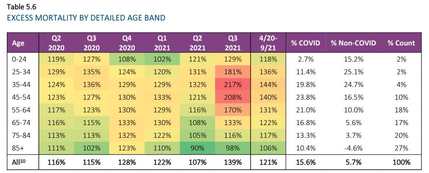
First, and most obviously, we see that Q2/Q3 COVID-19 mortality was 42% greater in 2021 than during 2020. Even if we include Q4, which is tainted by some vaccination administration, the increase is almost 16%. That's not supposed to happen after so many of the vulnerable elderly have died, with or without an effective vaccine.
We also see that the unknown causes of death being gradually farmed out from "Unknown" into the other categories. While that might not be suspicious on its own, I want to point to the dirty dog's analysis of Massachusetts data, which is incidentally being rolled up into a landmark lawsuit as we speak (more about this during Liam's Friday news report).

Where We Were With Insurance Data
In early January, we found out from a health insurer (One America) that non-COVID deaths among working age individuals in Indiana was at a statistically aberrant all-time high.
In early March, the CEO of German health insurance giant BKK presented evidence that the vaccines had already killed tens of thousands of Germans, and was fired the next day, the story paved over quickly.
Back in June, Lincoln National reported a 163% increase in death benefits paid out under its group life insurance policies during the whole of 2021.
On August 4, we got Reinsurance Group of America's (RGA's) financial reports showed massive 2021 losses that were downplayed by the report authors, plus plans for new accounting methods that we should all be worried are designed to sweep iatrogenocide under the rug.
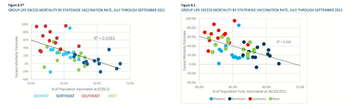
That was where we were when the latest Society of Actuaries report hit the ground, which shows group life insureds—particularly of working age—seeing even more excess mortality than the larger U.S. population. In particular, the sharp numbers during Q3 2021 coincides with vaccine mandates for working age individuals.
You can hear the actuaries discuss the changes since the experimental quasi-vaccine rollout.
Focus in on the part of the conversation 5:15 into the video. I'll transcribe the important part:
This is the first Group Life survey where we've been able to compare state level vaccination rates to the state level mortality percentages. And the data that we've looked at would have been percentage that were fully vaccinated by state as of June 30th, and we've compared that to the Q3 excess mortality by state, and we do indeed see that there is a moderate correlation—it's a negative correlation. So, those states having the higher vaccination rates showing a moderately lower excess mortality. And the R^2 correlation coefficient that we've seen is in the 0.32 to 0.38 range…
He does say that there are other factors influencing the relationship, but he focuses on climate and social distancing (what??) as opposed to what should be the primary focus: wealth effects.
My instinct is that these guys are paving over the true signals in the data, and I'll explain why…
A Simpson's Paradox in Plain Sight?
Section 8 of the report is where we focus. Yeah…you've got to read that far to find the juicy stuff. Sigh.
Section 8 breaks down some revealing statistics by geographic regions of the U.S., using states as the basic units of data aggregation.
Over the course of this reanalysis, we (myself and a "silent partner") recreate their diagrams using the same data sources they list.
Before we move any further, let us make clear what we mean by a Simpson's paradox. I will borrow figures from a study headed by a Dutch Professor of Developmental Neuroscience (Kievit et al, 2013).
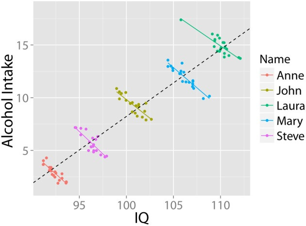
In this fictional toy example of a Simpson's paradox, the overall trendline suggests a correlation between higher alcohol intake and higher IQ. Before we cut to the chicken-and-egg problem (IQ = money = access?, drinking enables creative work?), we examine the coloring of the dots, which removes a confounding variable. For each individual in the hypothetical study, we see a negative correlation between IQ and alcohol intake (which makes sense for those and only those who are unfamiliar with well aged highland scotch, ahem).
Lesson: When a highly-associated confounder is unaccounted for, trendlines change and can even invert completely from any representation of the true effect of a variable on the outcome.
Most real world examples are not quite as pronounced as the one above, but good statistical "number sense" and experience looking with your head cocked the right way, may help you spot some without the use of a spreadsheet. Here is an example of where I suspected from the start I could immediately spot a Simpson's paradox.
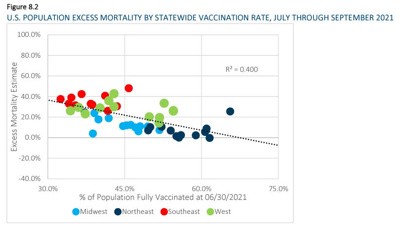
We see a downward trendline (as the SOA video talked about) suggesting that greater vaccination is associated with lower excess mortality during the associated time period. This isn't the only such graph in the paper, and all of them scream "Simpson's paradox" at me. In fact, the coloring of the dots alone makes me wonder if the actuary who created the diagrams was trying to signal to the public [through an intermediate like me who doesn't have a gun to his head] that the appearance of the trend is a bullpfizer illusion.
If you focus on each colored set of dots on its own, the regional trends appear…well…fairly flat. I do think that I detect a tiny downward trend, still, but let's be clear:
The regional grouping is not a perfect representation of some underlying confounder (which I strongly suspect is largely based on wealth).
The state aggregations themselves may (Iikely do) include their own confounding [largely wealth-related] effects, which I have already confirmed by zooming in for higher resolution at the county data level. But I'll have more on that when I finish my next county level analysis. I had to stop and reanalyze the SOA data because nobody else was doing it.
Next, let's take a look at a few graphs comparing (1) the June 30th, 2021 vaccination rates used by the SOA and also (2) the variable of median state household income each against (3) excess mortality from each of the four quarters of 2019, just before the "pandemic" hit.
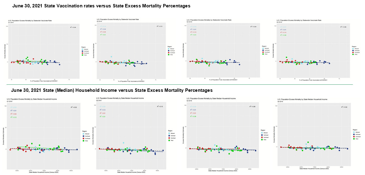
If you feel like you're just looking at a bunch of very flat trend lines (all 32 regional and 8 overall trend lines), you're right. And that's what we should expect, ordinarily. Sure, wealth might have effects on overall mortality, but excess mortality should mean revert to a very high degree. Overall, we should expect to be looking at somewhat noisy, flat data.
It is noteworthy however that most of the trend lines have barely negative slopes. In the case of median household income, this might be explained by upward mobility having a health effect that shows up gradually over time. However, we see these slightly negative slopes in the [future] vaccination rates, also. It is absurd to think that getting vaccinated in the future improves mortality now. On the other hand, this all makes sense with respect to my theory (I'll elevate this from hypothesis to theory now that I've seen it from so many angles, and without exception) that wealth differentials confound appearance of vaccine efficacy (VE).
Finally, we've recreated each of the SOA's graphs. Ours look just a tiny bit different, and we aren't sure exactly why except to note that our data was pulled on a later date and the CDC has multiple data series—one with raw data and one with estimates of how the data is expected to shake out once all reporting is complete. Also, in some of the CDC's data formats, excess mortality is always nonnegative, meaning that any negative number gets turned into zero. For the purposes of our work, we have pulled data prior to such applications of a floor (asserted minimum) that would be inappropriate for our purposes.
In other words, we have taken steps that are at least as good, if not superior to the steps taken by the SOA—but very possibly exactly the same, just on different dates with adjusted estimates by whatever means the CDC employs (which are not always perfect, ahem). And since our results look highly similar to the SOA's, but a little different, I'm not worried about it. Also, for what it's worth, the supposedly same graphs from their September 2021 report (left) are similar, but not the same as from this newer August 2022 report (right), indicating the change in the CDC's estimates of prior data over time.
Here is the 3Q 2021 excess mortality data (SOA's on the left, ours on the right). Note that our R^2 is identical to theirs, and our overall trend line (dashed) has almost the exact same slope and intercepts. Our dots are placed slightly differently, but it's clear that the data hasn't changed all that much between the data pulls. We made our dots a little smaller than beach ball sized so that none of them get hidden behind the others.
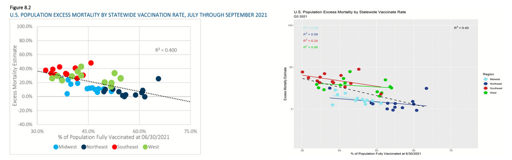
We see exactly what I predicted, which is that the trend lines within regions are substantially flatter. A Simpson's paradox does not always result in inversion of the sign of the slope—just a substantial change. And in particular, our four trendlines have extremely close angles of incidence to the axes! This indicates that we really did remove a confounder at the regional level.
Why didn't the SOA actuaries take this step? Isn't this…the obvious step to a well-trained statistician?
Now, let's check to see how well this trend matches a comparison between median household income and excess mortality.
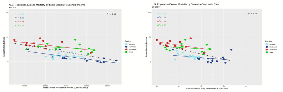
This is about as close as it gets to swapping out a single real world variable on a scatter plot and seeing highly similar results. The overall R^2 (correlation) fit in the regressions is nearly precisely the same. While we cannot expect the slopes to be the same due to a lack of unit comparison in the x-axis variables, the relationships are closer than I could possibly have predicted! Not only that, the R^2 values in the scatter plot comparing household income to excess mortality are higher, indicating a stronger relationship between the variables. This is pretty strong evidence that wealth differentials drive the appearance of VE when data is aggregated at this level.
Now, recall what I said about excess mortality being a statistic that should mean revert to a high degree? Let's take a step back in time and check out the Q2 2020 data:
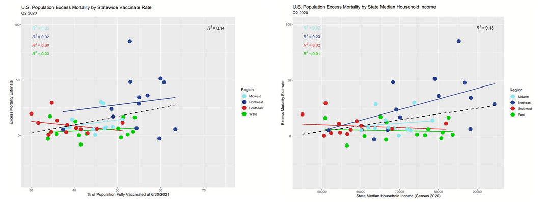
These trend lines are largely sign-reversed from the post-vaccination data. Absent a confounding variable, the process of mean reversion should result in trend lines of substantially positive or negative slopes (*with respect to variables that don't have an effect on mortality) to flip-flop over time. On a more practical level, we know that the Northeast had higher COVID-19 mortality earlier during the pandemic, so we should expect for it to have fewer deaths later on during the pandemic. So the apparent remaining advantage to the "more vaccinated states" is almost surely driven largely or entirely by mean reversion of the excess mortality in the Northeastern states. In totality, the summary differences between regions looks like exactly what you would expect knowing the black and hispanic Americans suffered the worst from COVID-19, and they are concentrated most in the South and second-most in the Northeast.

There is no reason left to suggest any of the excess mortality data trend is driven by vaccination, but every reason to think that it's almost entirely driven by the health effects associated with wealth. The SOA actuaries performed none of this analysis before making a video saying that the aggregate state data trend line demonstrated a meaningful signal of vaccine efficacy.
On another note, isn't it interesting that the pronarrative biostatisticians like Jeffrey Morris seem to pick up on the Simpson's paradoxes in only the most hotly debated data sets for which there is scant epistemological certainty (how did he correct for the thousands of people admittedly held out of the data, acknowledged by the ONS but without demographics?), but miss observations such as this one that were already visually made to stand out? Last year he bragged to me that he had several dozen biostatisticians working under him. I keep wondering what in the Pfizer they're doing.

Vaccination vs. Wealth
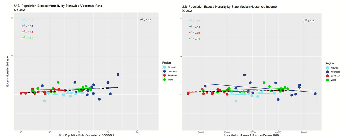
In numerous articles this year, I've shown indications that apparent VE in U.S. county and state data appears to be completely explained by wealth effects. So far, our reanalysis of the SOA report data is entirely consistent with the hypothesis that wealth effects generate an appearance of VE where none exists. Let's see if the association continues beyond the Q3 2021 shock quarter, and whether we see gentler slopes in the trend lines (due to mean reversion if my theories are correct).
For the first quarter of 2022, the overall trend lines (dashed lines) are nearly a perfect match. The slopes are still negative, but more gently negative.

For the second quarter of 2022, the overall trend lines (dashed lines) are nearly a perfect match once again. Now the slopes are mostly slightly positive, but getting close to flat—just like they were in 2019 when there were no vaccines.
So, if there is no VE, what variable explains the Q3 2021 shock quarter?
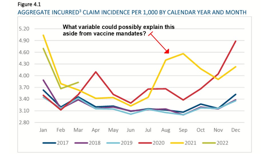
I'll leave you to guess, but I've been giving my opinion for well over a year now (here, here, and elsewhere).
Data Sources
Part of the goal was to use exactly the same data as the actuarial report as often as possible. However, it is revealing to add additional data in some cases—most of all because I've been studying wealth effects on vaccination data in general. These data sets, their organization, and the graphs generated have been made available to Jessica Rose, PhD and to Joel Smalley. They can be made available to any other researchers interested in checking or publishing the work along with their own.
CDC Vaccination data (downloaded 6.31.21 data on 8/22/22)
https://data.cdc.gov/Vaccinations/COVID-19-Vaccinations-in-the-United-States-Jurisdi/unsk-b7fc/data
CDC Excess Mortality Data (downloaded national and state estimates of excess deaths 8/22/22)
https://www.cdc.gov/nchs/nvss/vsrr/covid19/excess_deaths.htm
State Population Data (downloaded 8/22/22)
https://www.census.gov/newsroom/press-kits/2021/2021-national-state-population-estimates.html
https://www2.census.gov/programs-surveys/popest/tables/2020-2021/state/totals/NST-EST2021-POP.xlsx
Income by State Data (downloaded 8/23/22)
https://www.census.gov/data/tables/time-series/demo/income-poverty/historical-income-households.html
median household income by state table H-8
https://www2.census.gov/programs-surveys/cps/tables/time-series/historical-income-households/h08.xlsx


Comments
Post a Comment